Tripper
Glam Rock based typeface and design!
About
About
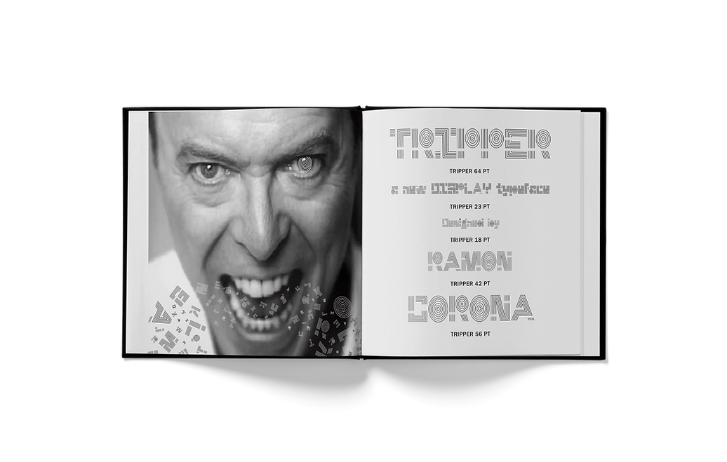
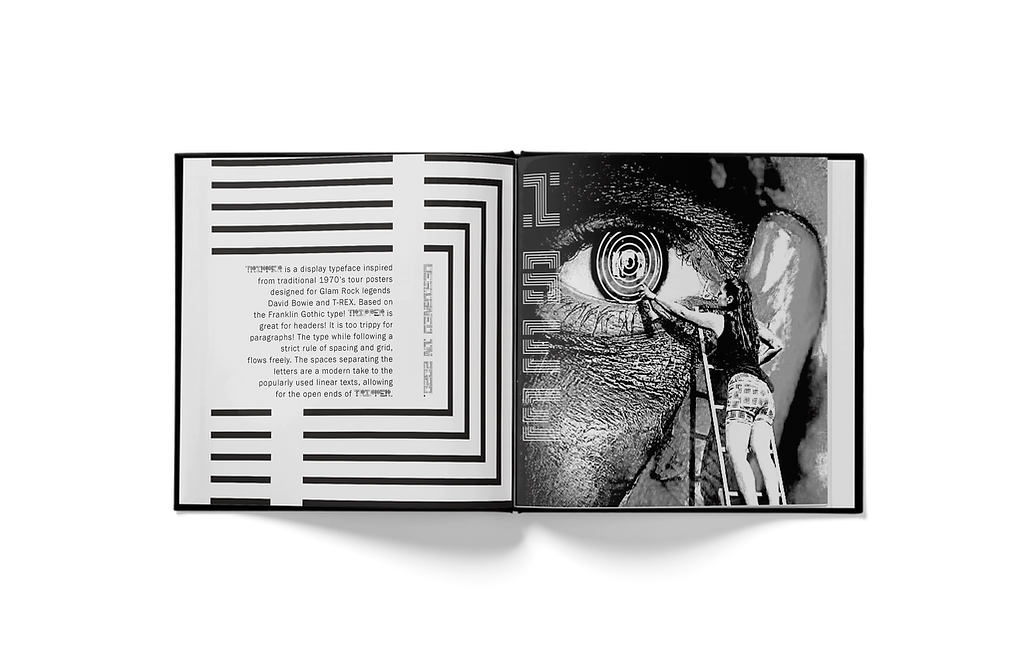
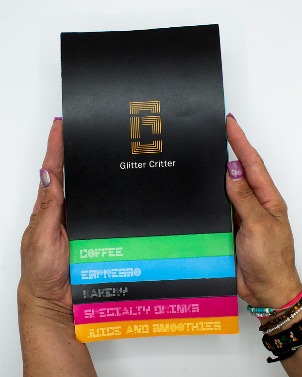
This project first started with designing a typeface, which I named TRIPPER. My typeface was then used to expand on a brand for a cafe and other deliverables! The cafe, Glitter Critter is based on the Glam Rock music genre, which involves legends like David Bowie and T-Rex!
Problem
Problem
In order to design something for a specific music genre, there needs to be an understanding of that era and environment. Due to ignorance of Glam Rock, it took many hours of research and diving into playlists to get a better understanding of the style of this genre. (A lot of great songs came from this!)

Design Solution
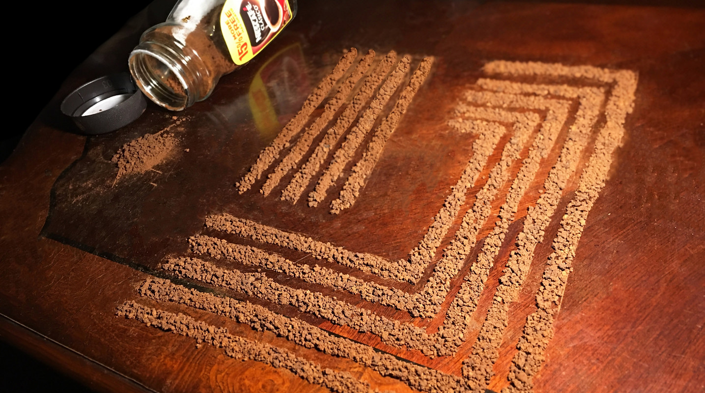
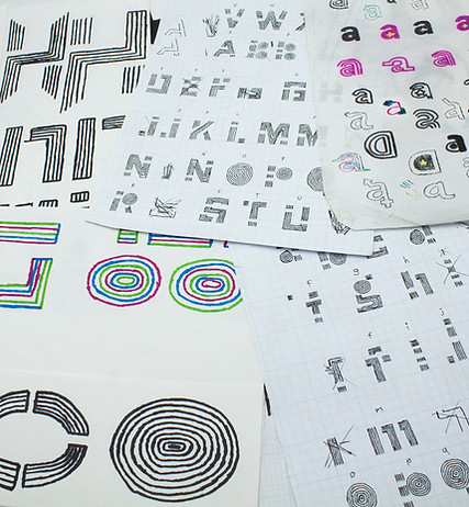
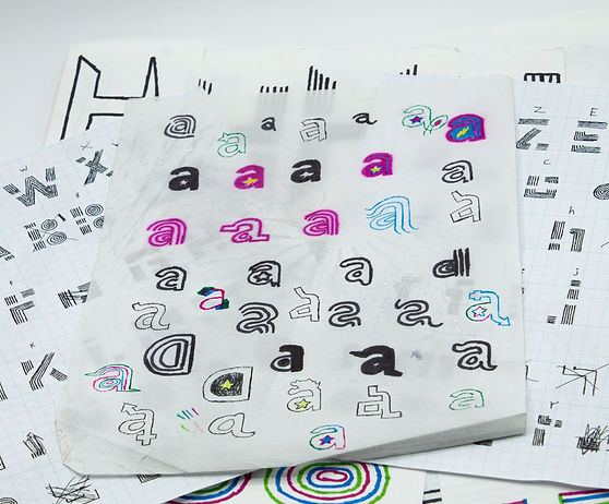
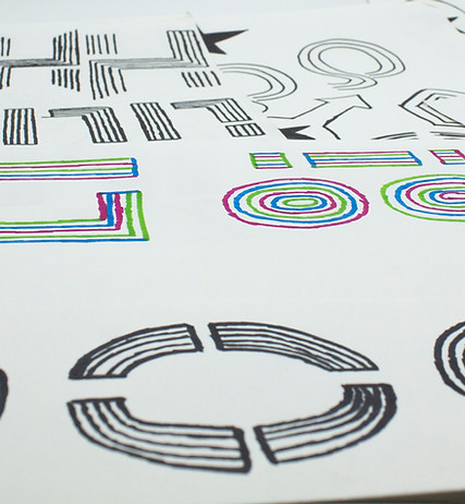
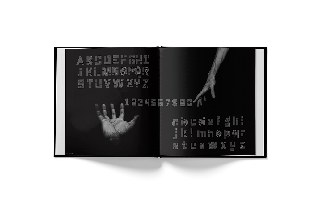
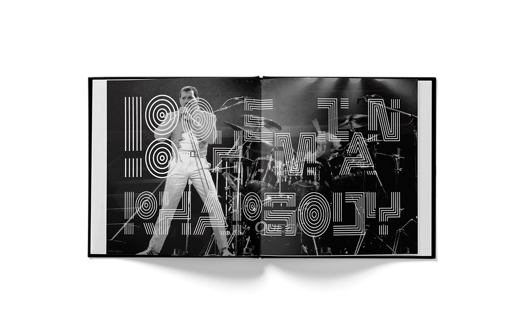
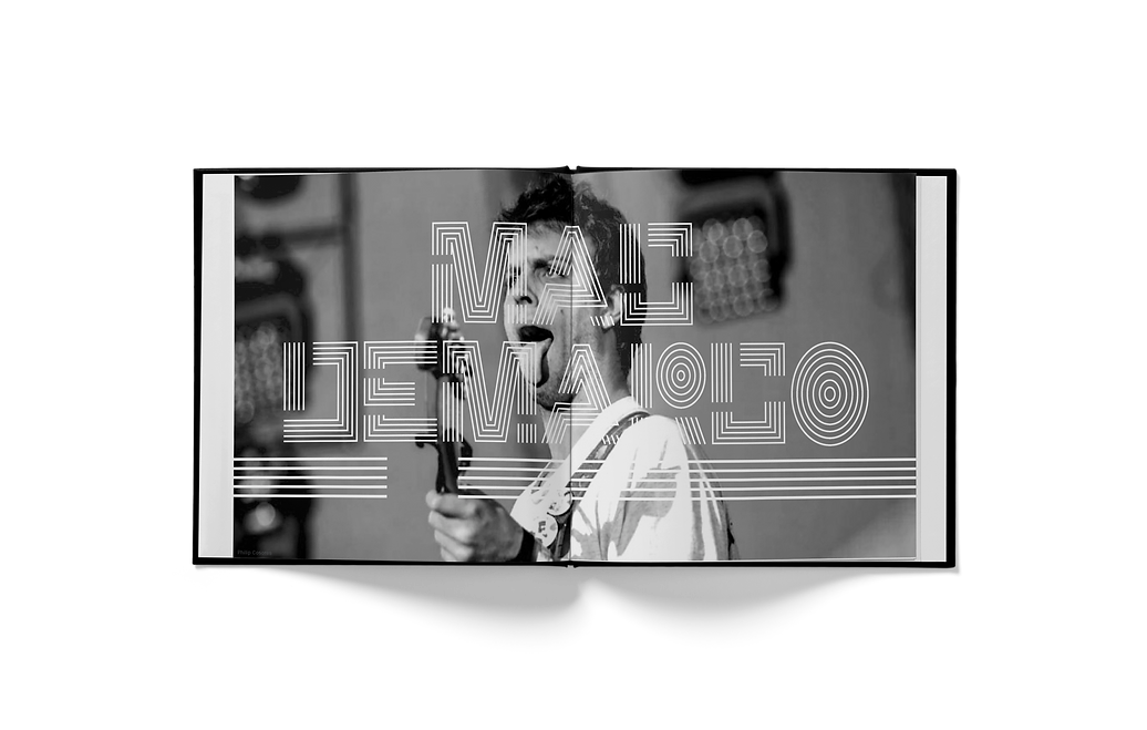
What was seen frequently throughout the research was this very flamboyant and colorful style to their artwork. The typography used in tour posters was either very line-based or a bit groovy-looking. With this in mind, I explored playing with lines in order to design my typeface, TRIPPER. The aesthetic also became very colorful and illustration based to match the genre.
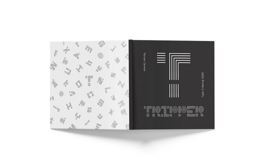
Logo
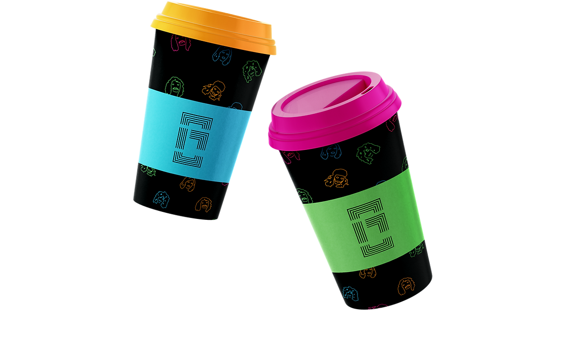
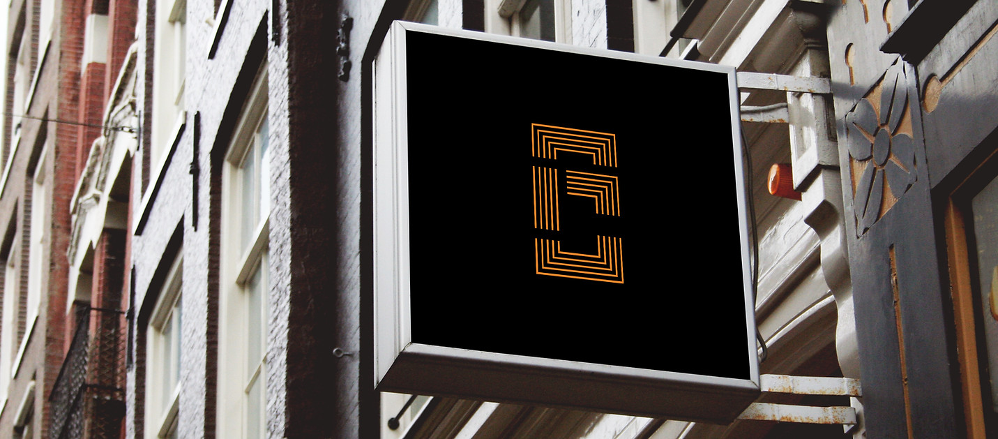
There were some challenges to maintaining a clean and bold look to the logo since TRIPPER has 5 lines and follows a very strict grid system. For the Glam Rock cafe, the name "Glitter Critter" was chosen. The logo is a combination of the G and the C while still following the grid system and lines of TRIPPER.
Moodboard
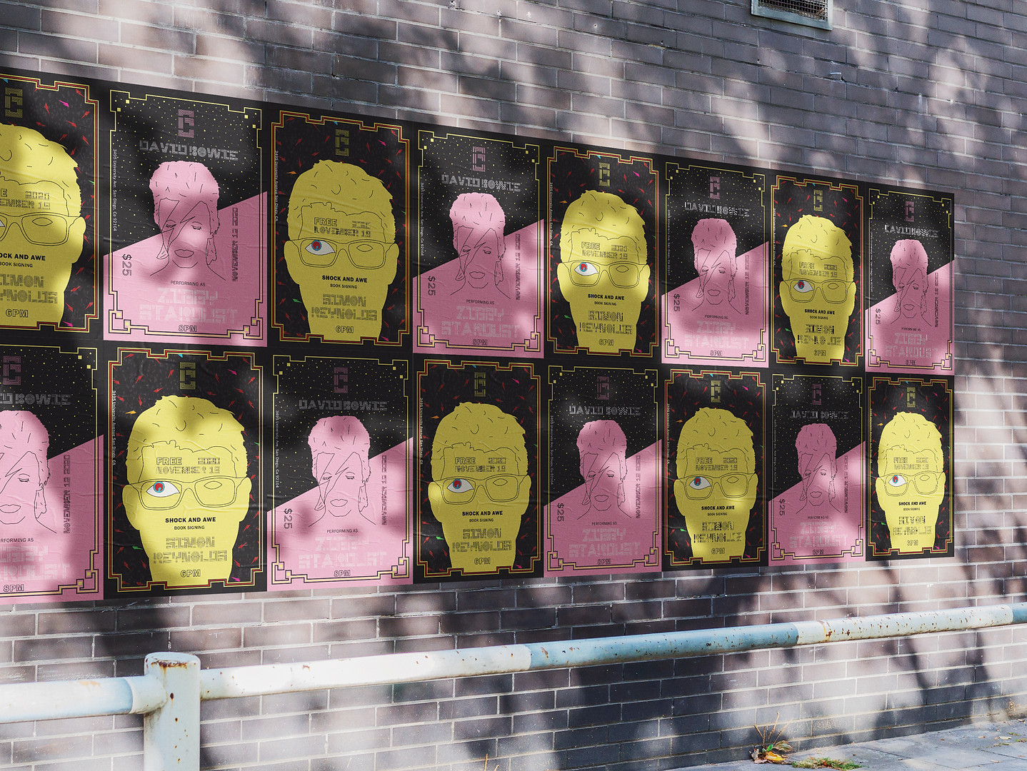
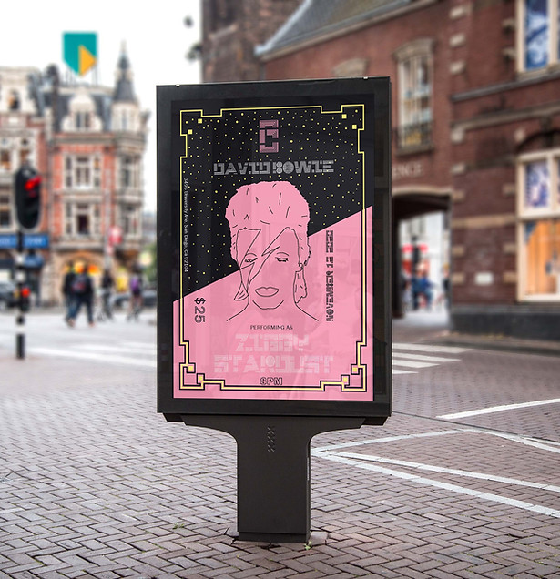
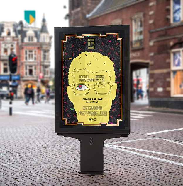
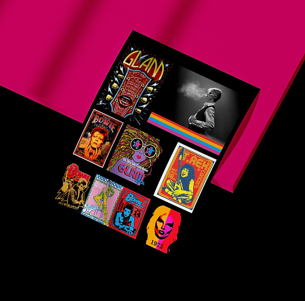
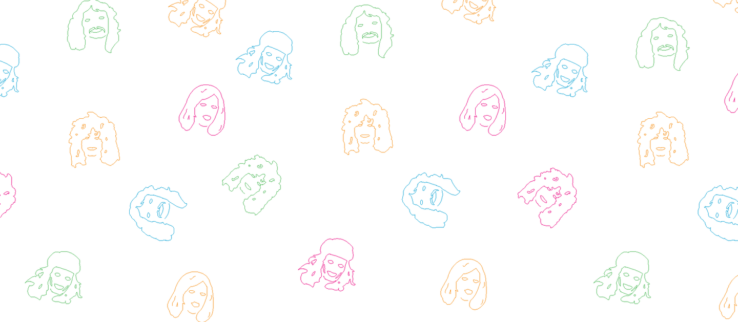
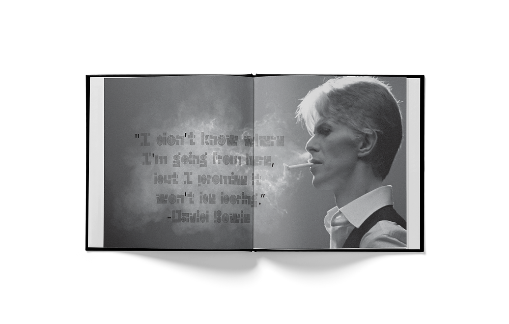
My moodboard focuses on amazing posters from the 70's and Glam Rock era. This included tour posters or art posters that involved David Bowie and T-Rex. The use of color and typography is something that captured my attention and became an inspiration throughout my process of designing TRIPPER and how it may expand.
Hex: E90980
RGB: 233,9,128
CMYK: 1,100,11,0
Hex: 50B957
RGB: 80,185,87
CMYK: 69,0,90,0
Hex: F7931E
RGB: 247,147,30
CMYK: 0,50,100,0
Hex: 03A6D5
RGB: 3,166,213
CMYK: 75,16,5,0
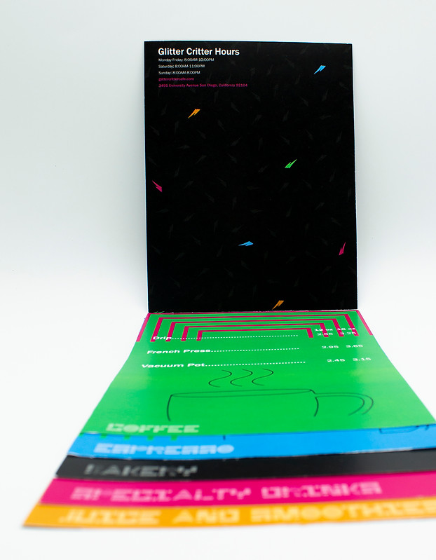
To add some flavor to the menu, besides the use of typographic elements, there are icons to help represent the individual pages. Each page is a different category with a wonderful variety of options for the customer.
Coffee cups, bakery and juices/drinks.


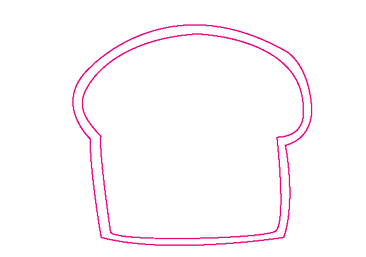
Icons
Applications
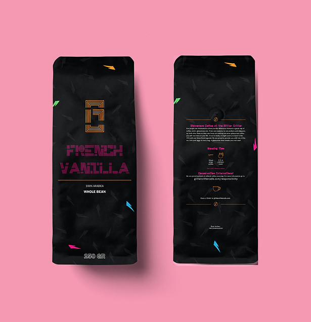
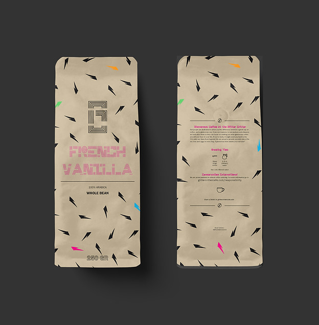
Every cafe needs an engaging menu that is easy to maneuver. Glitter Critter is no exception. The menu maintains this very vibrant/neon effect to represent the colorful side of Glam Rock. The lightning bolt pattern was inspired by the legend David Bowie and their iconic lightning mark. In order to maintain consistency, the menu follows a very clean and aligned structure. This structure is followed throughout the rest of the applications such as the posters and coffee merch.