Till
Food Service App
About
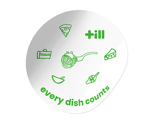
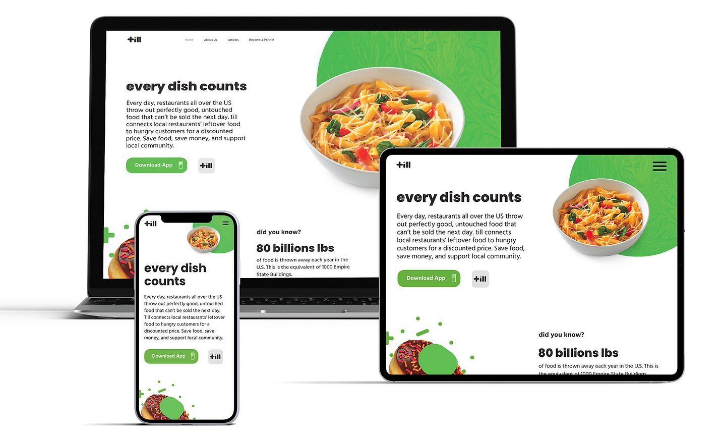
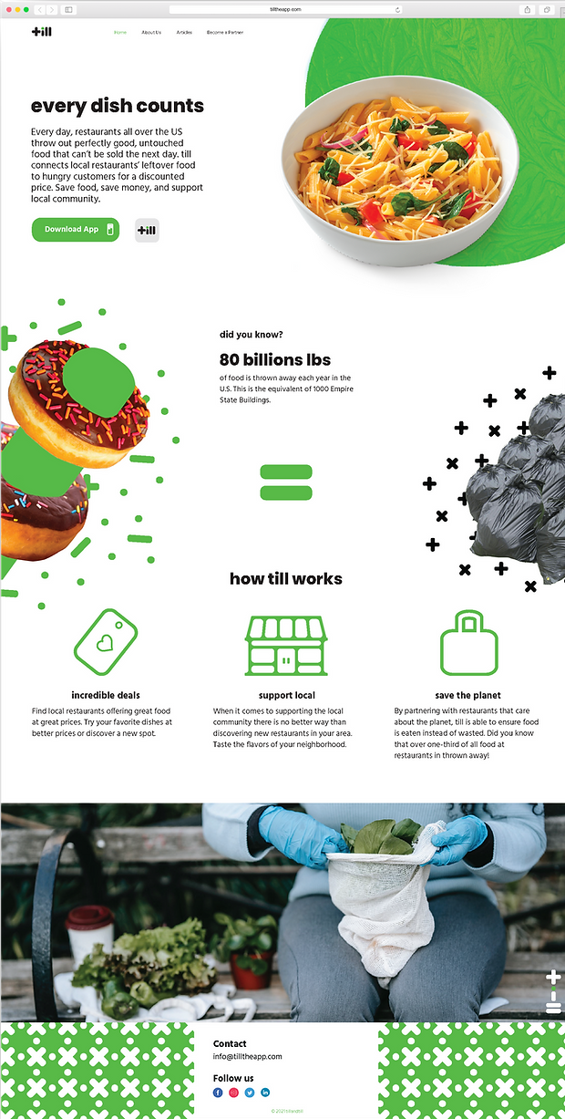
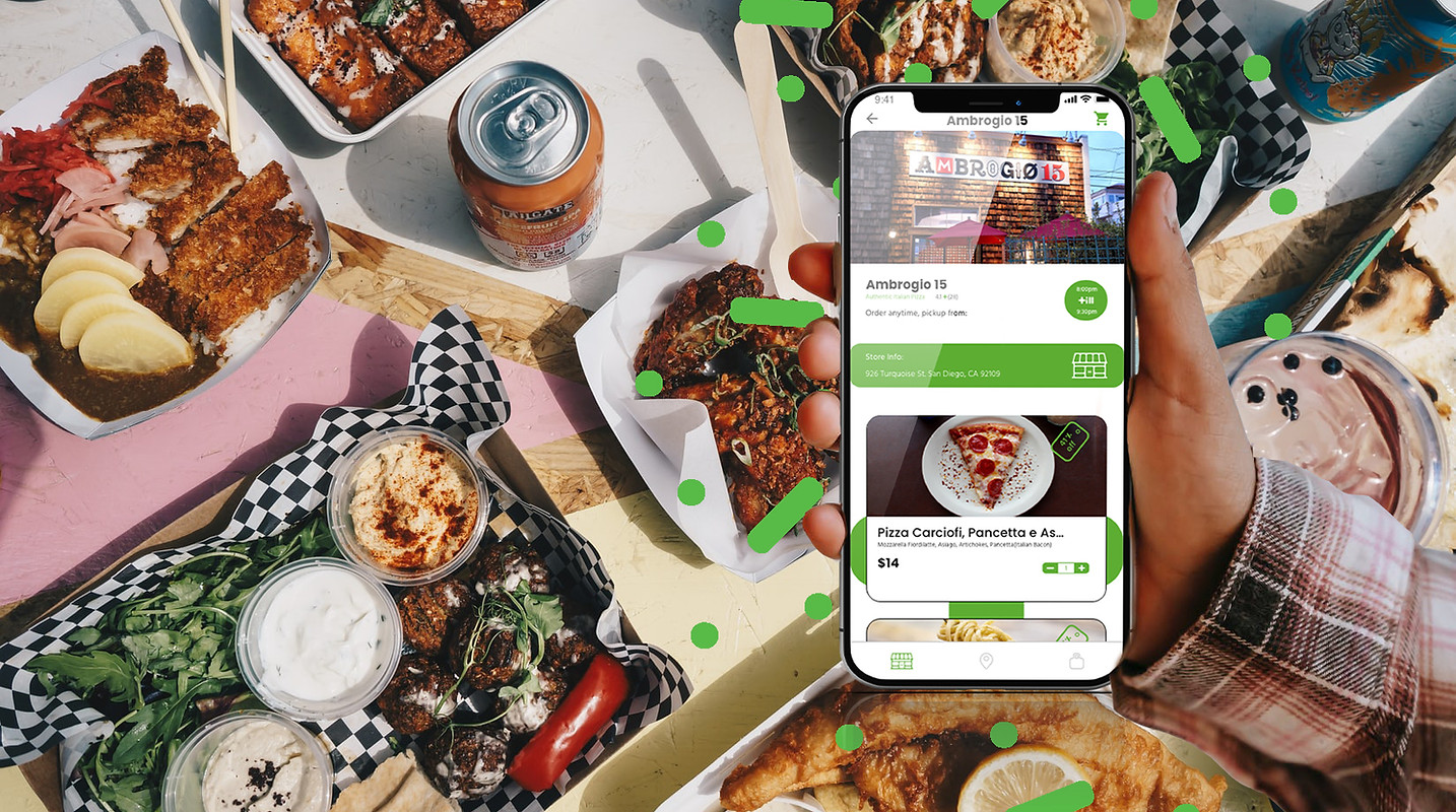
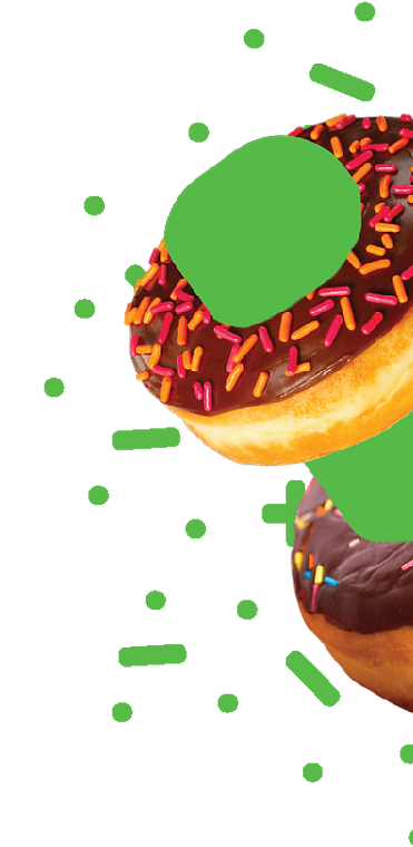
Till is a food service app dedicated to being sustainable by reducing food waste that so many restaurants dispose of when it is time to close. Not only does Till help reduce waste, they do so by providing their users with great food at a great discount. Every dish counts.
Problem
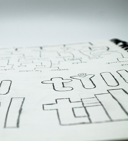
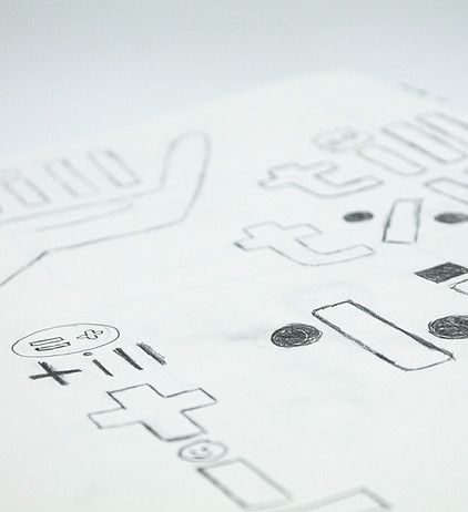
The problem with till's existing logotype is that there were no set brand elements or guidelines. The clients felt set on some of their ideas and it was my responsibility to expand on their logo by creating a mark with deeper meaning and then design a whole system based on that.
Design Solution
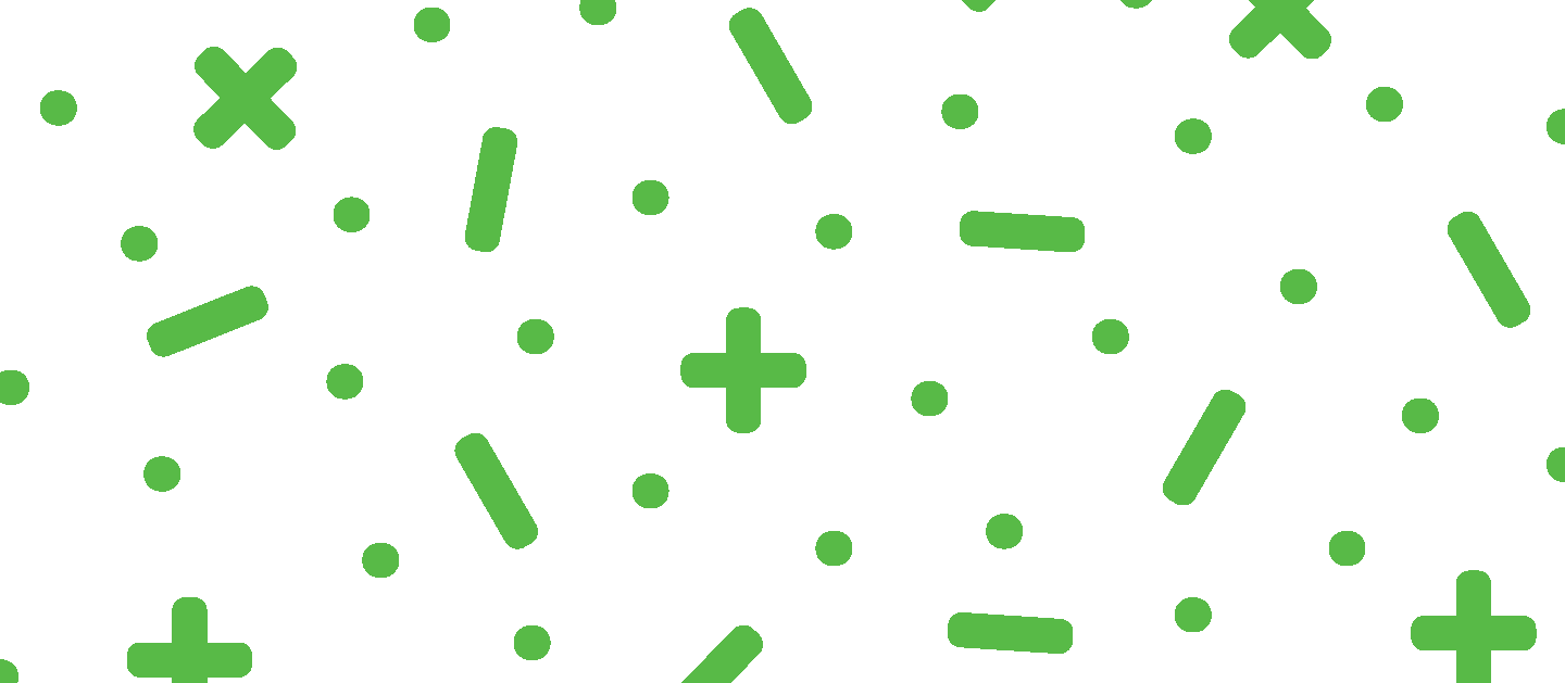
As till described their brand and ideas for the future, the information that stood with me were those calculations about how much food is wasted per day and such." The letters were designed and arranged in a way so that they look like mathematician symbols such as the "plus" "minus" and "equal"sign

Logo
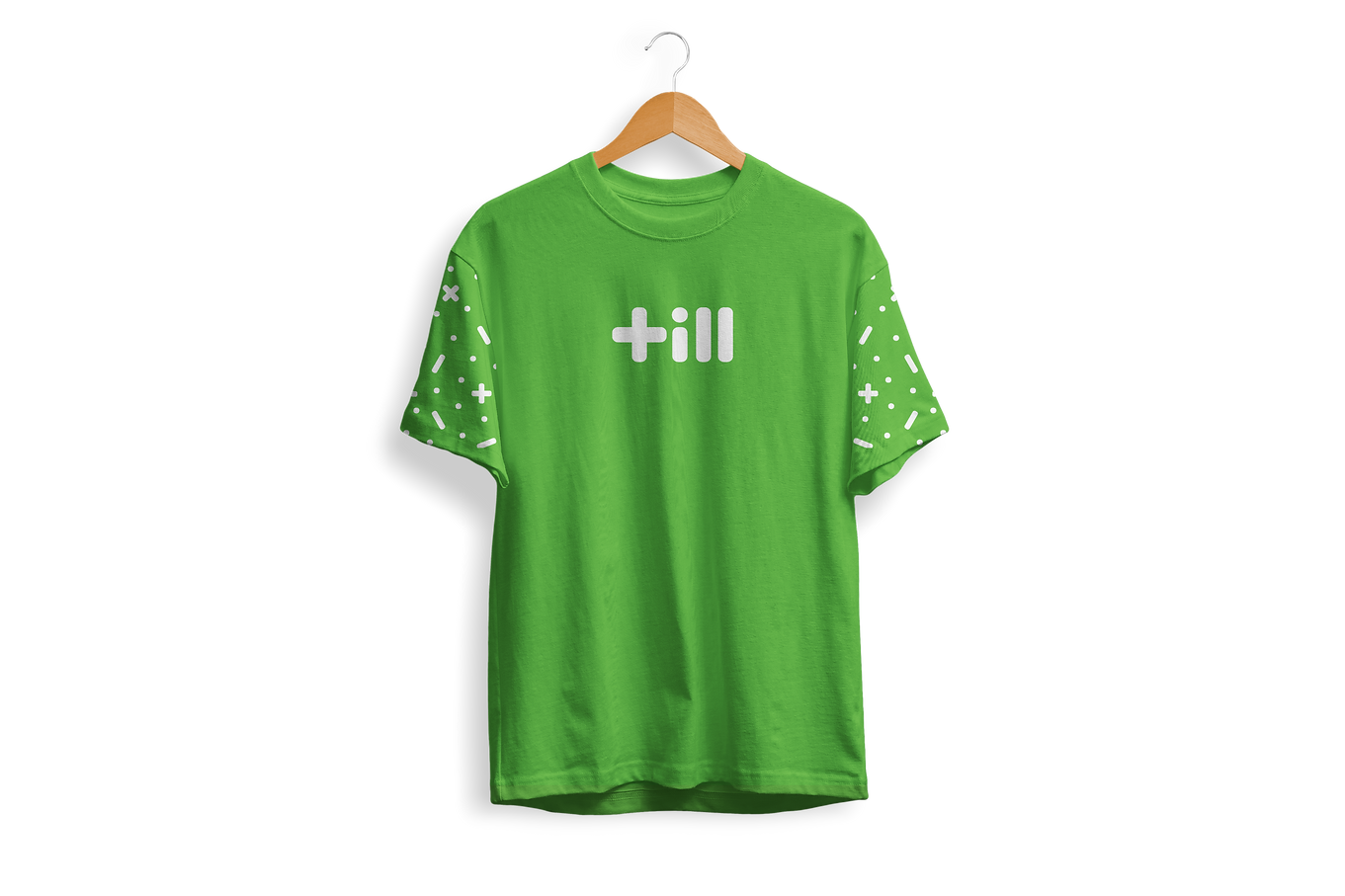
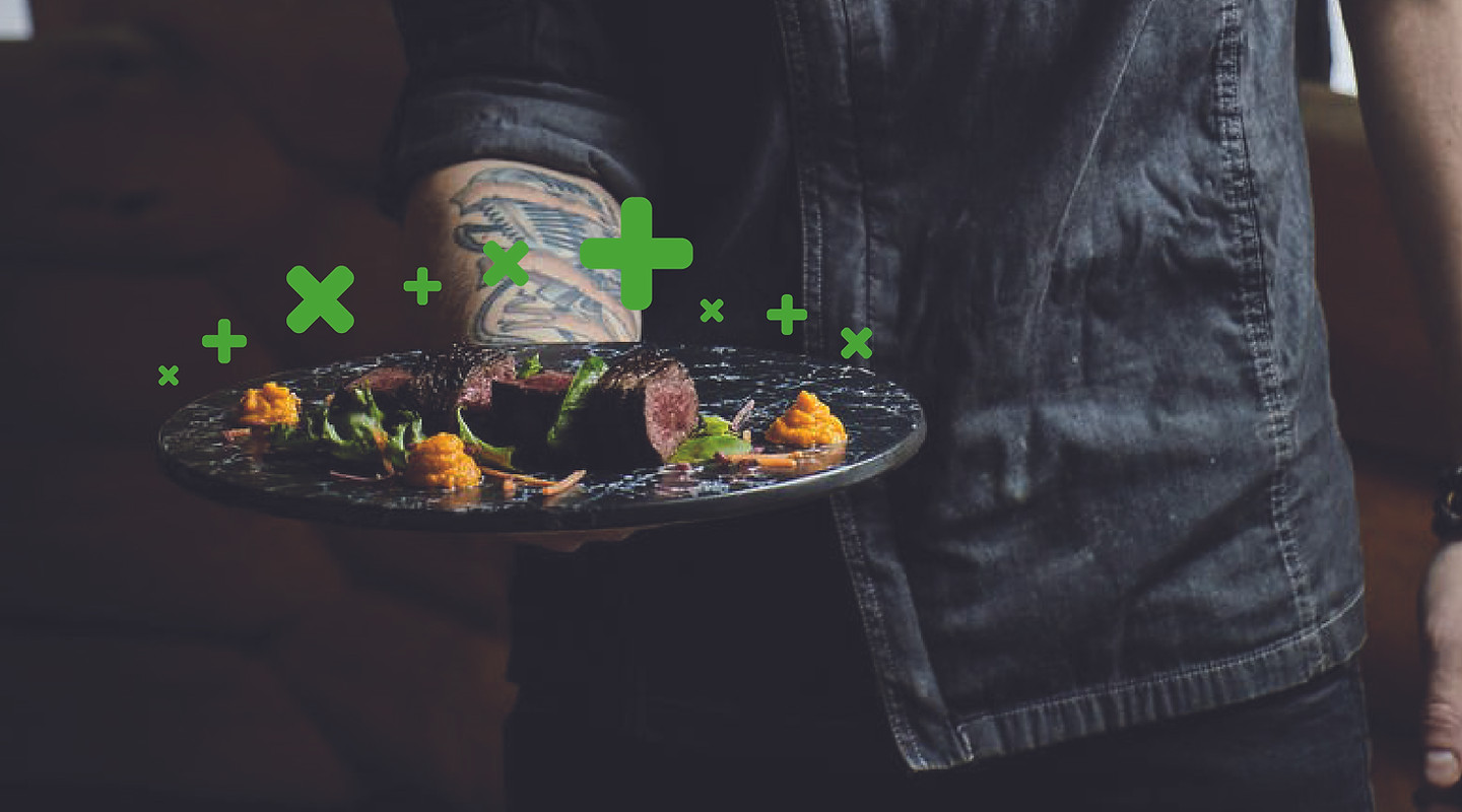
Till was designed as a logotype to follow up with the client's request of not making big adjustments. The letters are math symbols, which provided great ideas for a pattern. This mathematical meaning behind the message adds to the change and discounts till can provide.
Hex: 5ABA47
RGB: 90,186,71
CMYK: 67,0,100,0
Hex: FFFFFF
RGB: 255,255,25
CMYK: 0,0,0,0
RGB: 231f20
RGB: 35,31,32
CMYK: 0,0,0,100
Brand Identity
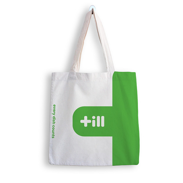
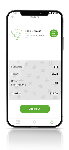
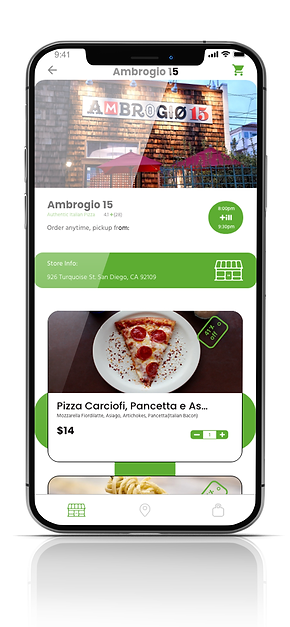
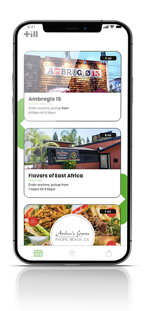
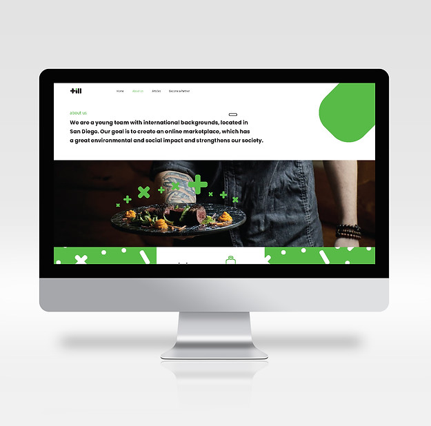
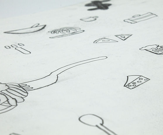
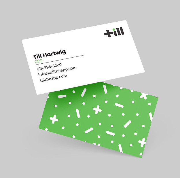
Till provided a great opportunity to expand on the brand elements towards a good amount of deliverables. We first see how the brand identity is being used on the business cards, which is a good start to seeing the brand follow a modern and bold look . This aesthetic spreads into stickers, t-shirts, till web pages and most importantly, some pages of the till app.