Madre Raíz
Packaging for Heirloom Seeds
About
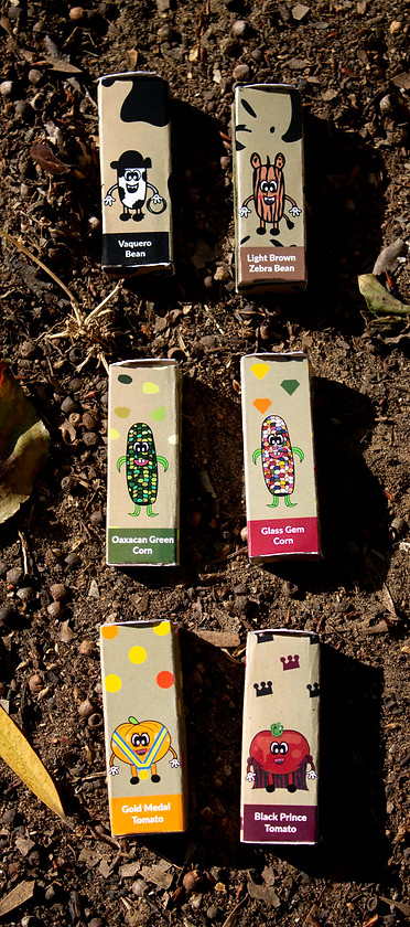
Madre Raíz is an heirloom seed company dedicated to connecting its customers to their ancestral roots. Heirloom seeds can date back as much as 300 years old. The design for Madre Raíz(Mother Root) was made for adults to not only enjoy growing the seeds, but to educate the younger crowds with fun characters and illustrations.
Problem
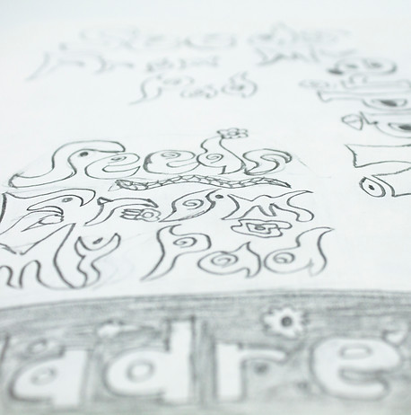
Heirloom seeds are organic and non-GMO. It was a challenge to create a design that did not look like an average grocery store packaging. This involved researching more hand-drawn type, soothing color palettes and studying what elements could be played with off the seeds once they are grown as well.
Design Solution
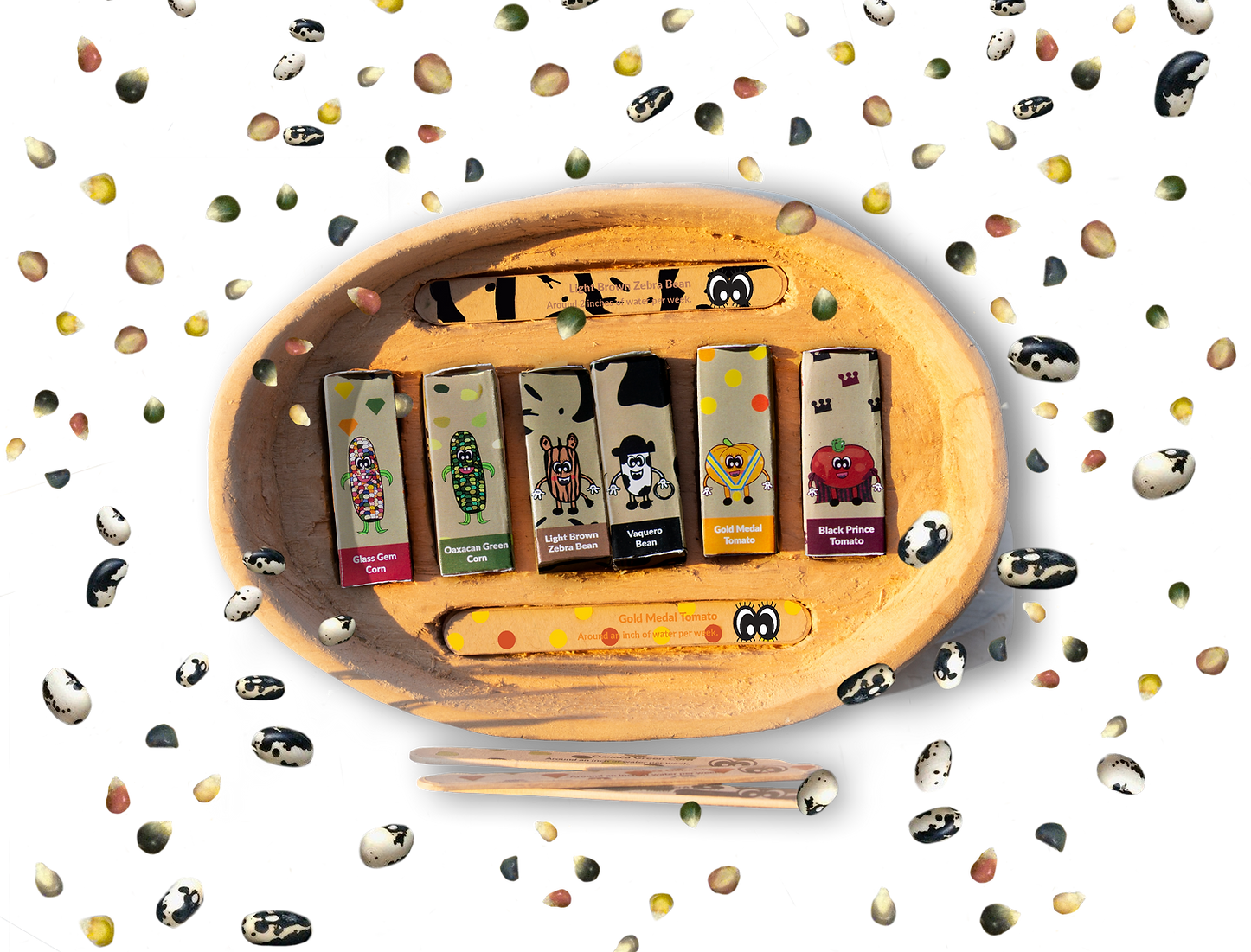
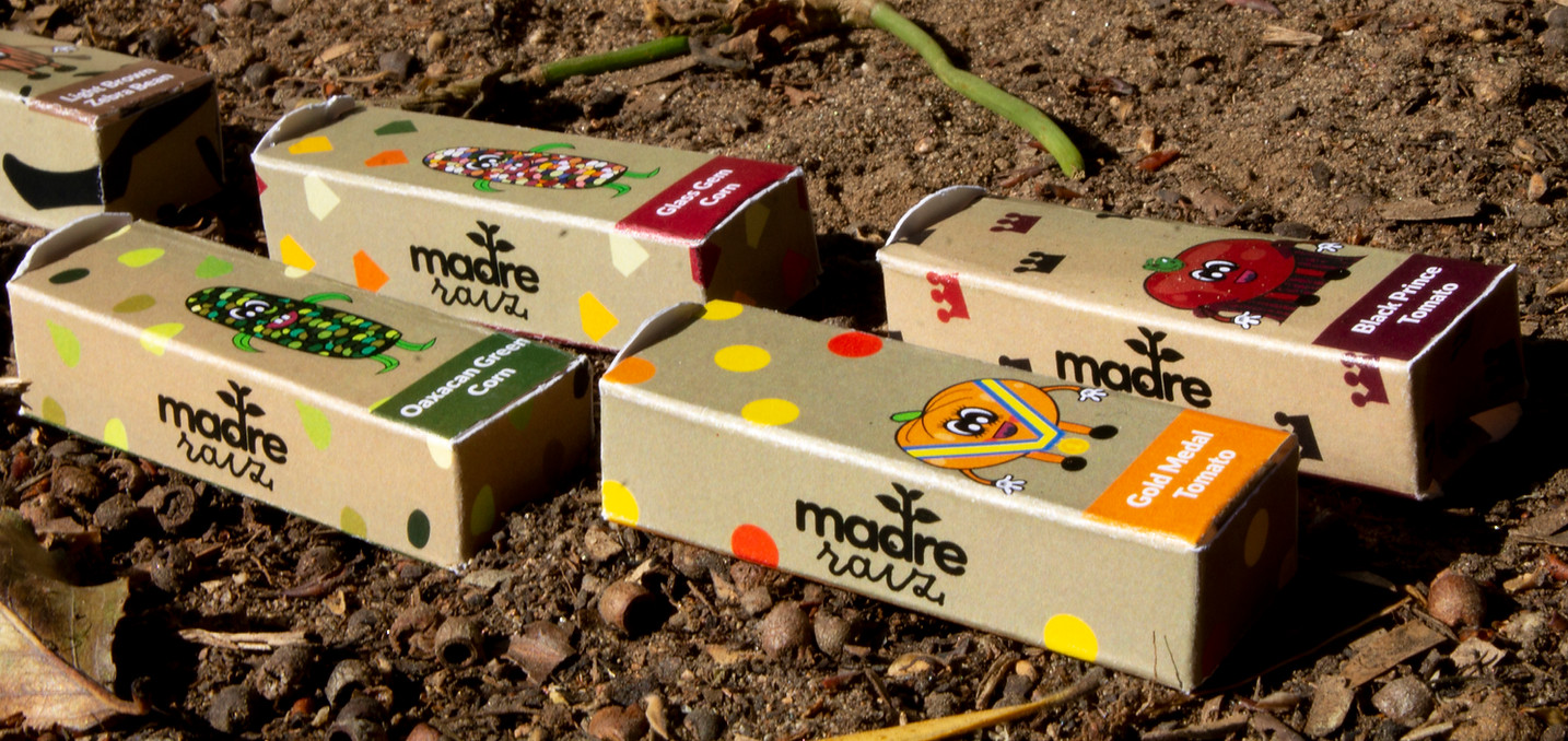
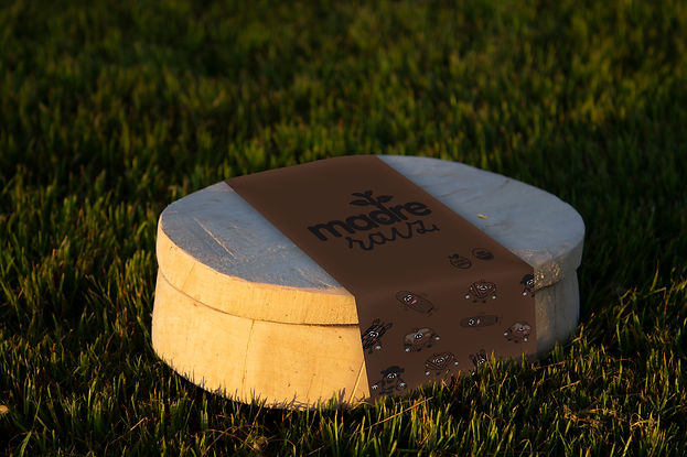
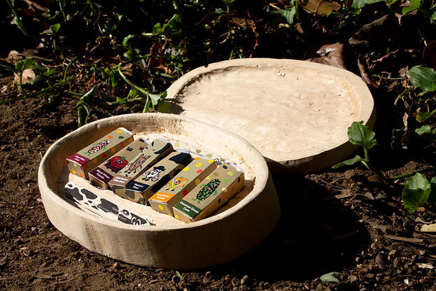
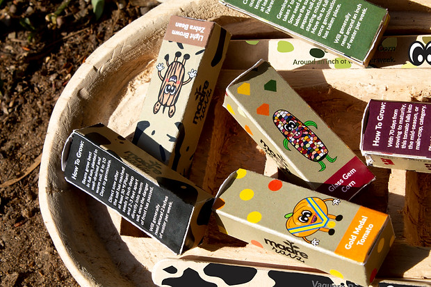
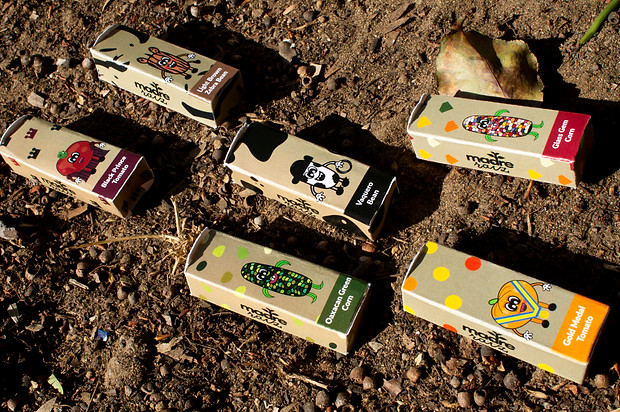
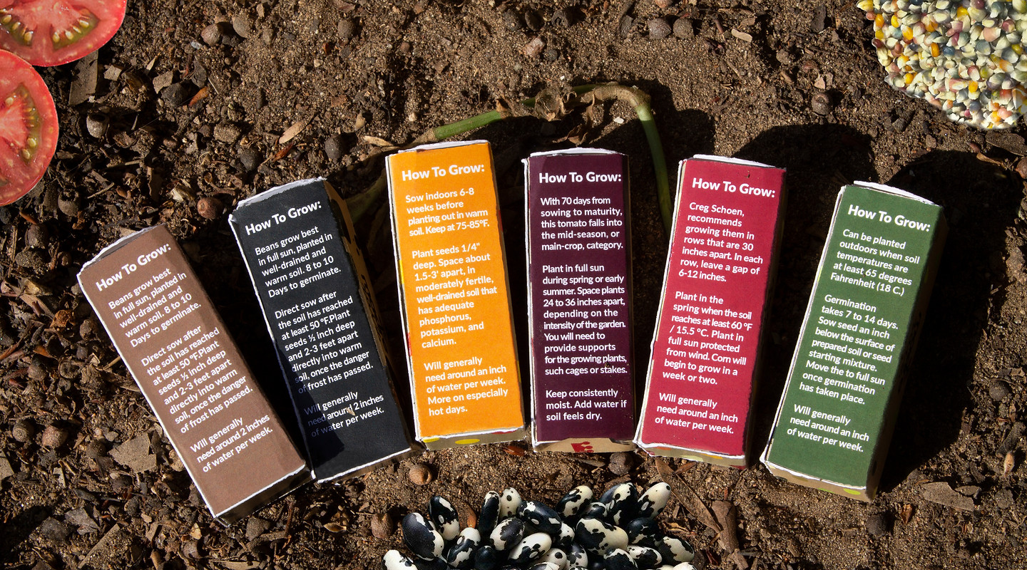
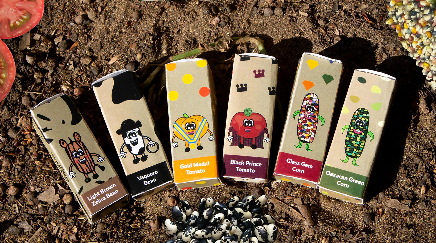
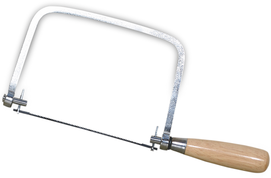
My solution for Madre Raíz involved utilizing both a modern looking round serif type and a hand-drawn type for the logo. To maintain this hand-drawn feel, the focus went towards illustrating characters of the crops and creating a special color palette for each packaging based on the characteristics of the seeds. Photography was not utilized and the main packaging itself was hand cut and carved out of wood!
Logotype
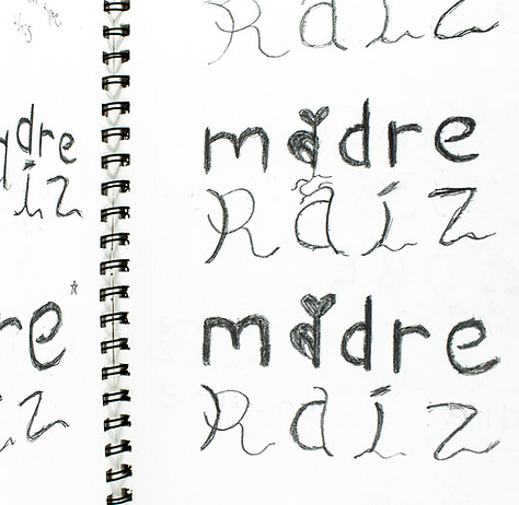
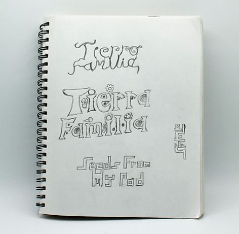
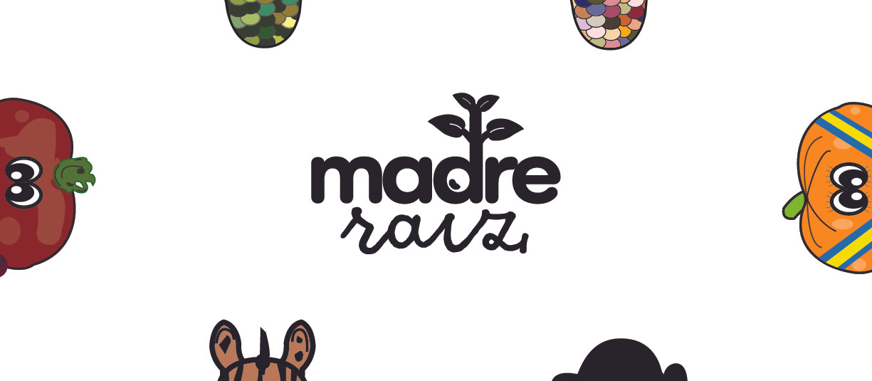
The Madre Raíz logotype utilizes the round serif typeface "Como" for the word "madre" and the typeface "goodlife script" for "raíz". The typeface at the bottom visually helps to portray roots while madre at the top is bolder to represent grown crops. The i connects with the d at the top to show the growth of a seed!
Hex: 931A2D
RGB: 147,26,45
CMYK: 27,100,82,26
Hex: 515625
RGB: 81,86,37
CMYK: 62,47,100,38
Hex: 895E41
RGB: 137,94,65
CMYK: 37,60,77,24
Hex: 231F20
RGB: 35,31,32
CMYK: 0,0,0,100
Hex: F38720
RGB: 243,135,32
CMYK: 1,57,100,0
Hex: 590625
RGB: 89,6,37
CMYK: 40,98,65,56
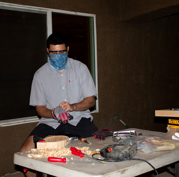
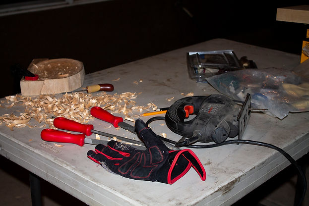
Process
Due to the covid-19 pandemic, my access to any machinery or materials was limited. I had to rely on my wood-cut and carving skills in order to achieve the packaging I envisioned. This involved lots of work from home with the equipment I had available from my family. The wood I used for the packaging is basswood.

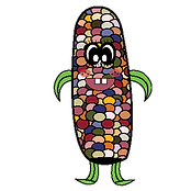


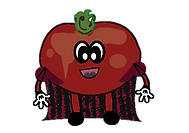
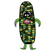
Characters
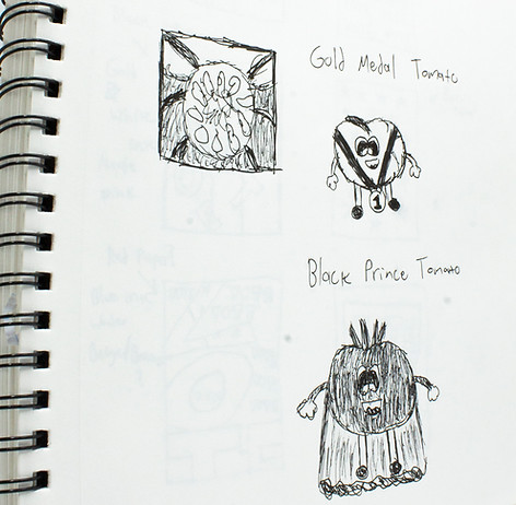
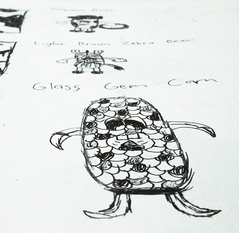
Each character design has been thought out to fit their specific seed and individual packaging. The traits of the seed were carefully studied for the characters to have unique qualities. This opened up ideas for patterns and color palette options. The expressions on their faces are meant to be light-hearted and playful to invite the customer into the world of heirloom-seeds.