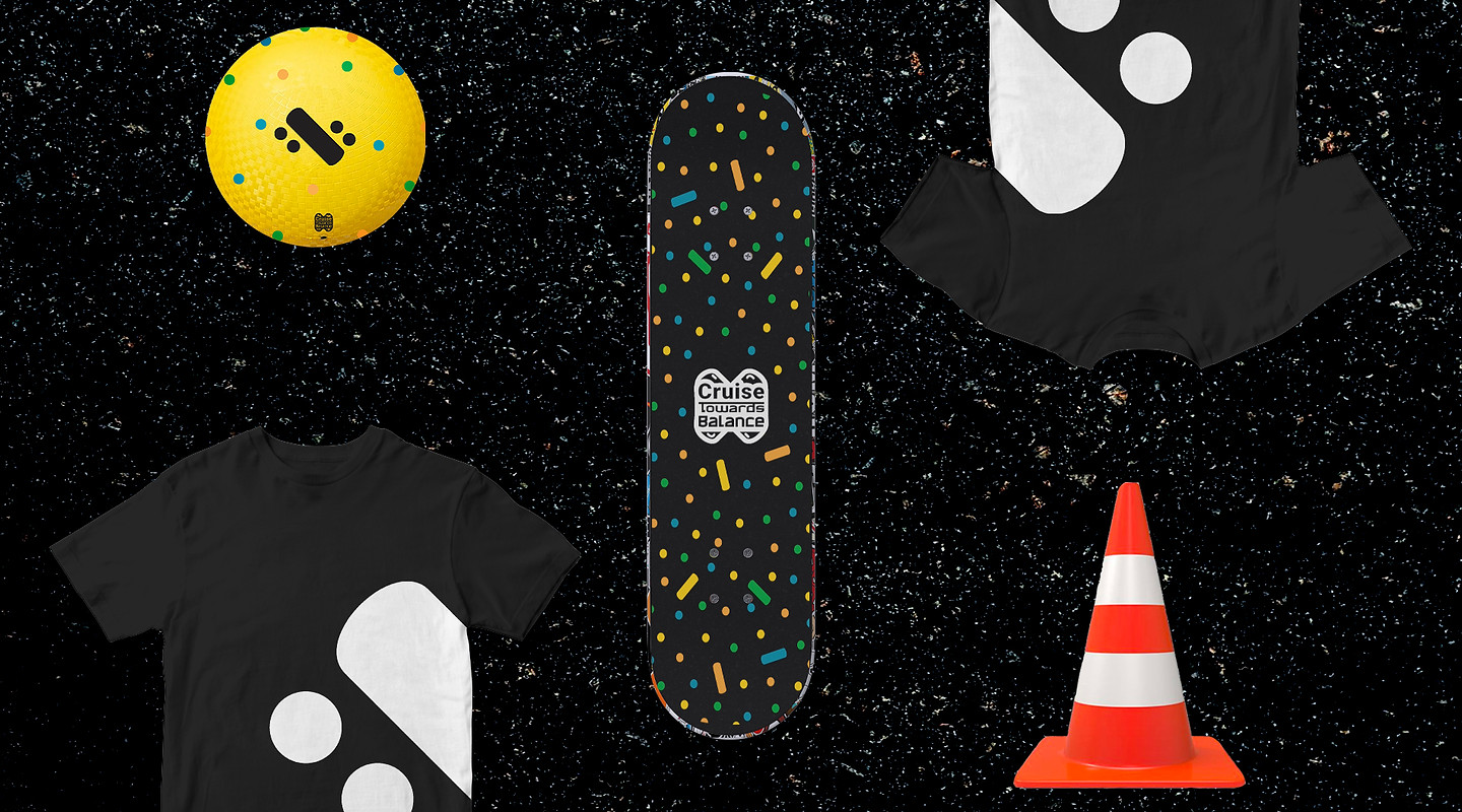

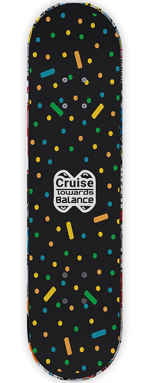
Cruise Towards Balance
#Appreciating Simplicity- Skateboarding
About
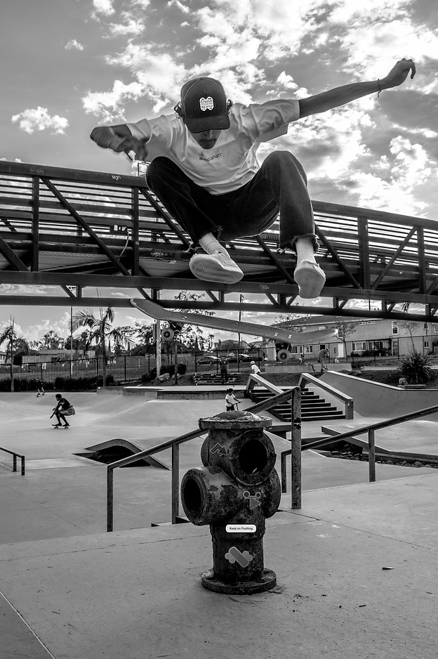
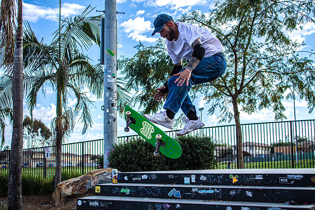
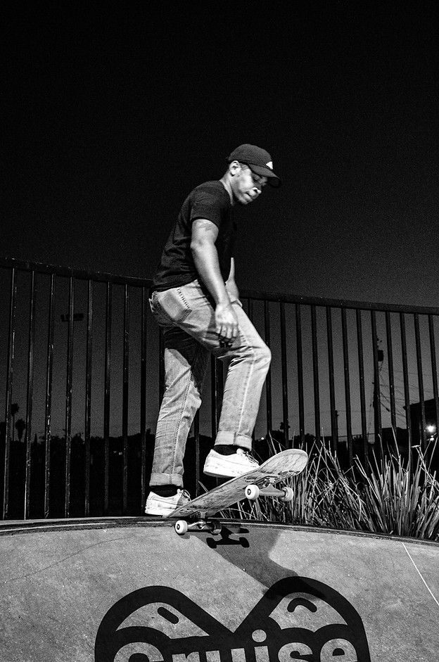
Cruise Towards Balance is a skateboarding campaign that is #appreciatingsimplicity by focusing on the beauty of balance. Balance is something that we typically do not pay attention to but is crucial for skateboarding in order to do tricks or enjoy a relaxing cruise down the street. Balance is needed in our lives!
Problem
Skateboarding typically has a gritty graphic style associated with it. Something that looks like graffiti, paint
or hand-drawn with thick markers. My design started with this and it was difficult to narrow down on something simple about skateboarding as there is a lot occurring when you are riding your board. I had considered the idea of feeling a breeze as you pick up speed, but found something significant!
Design Solution
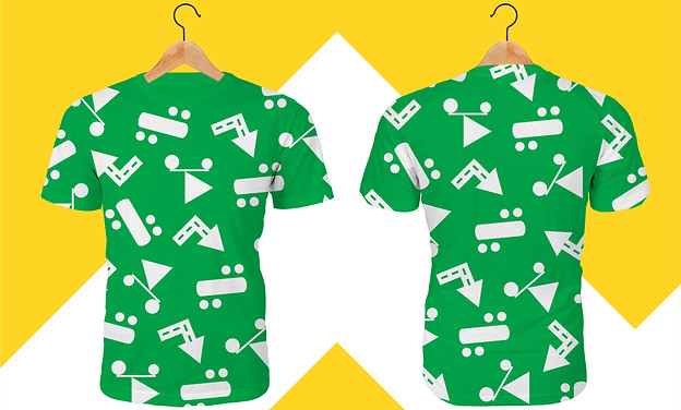
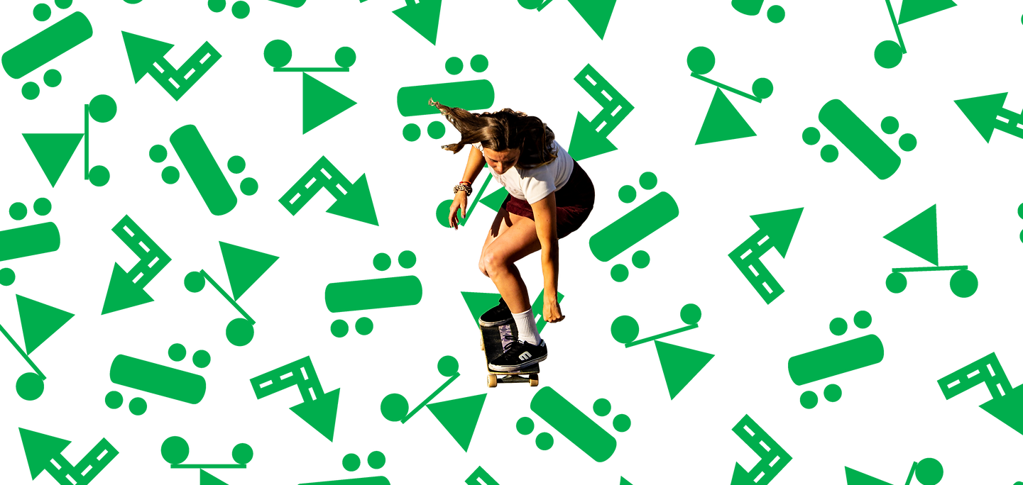
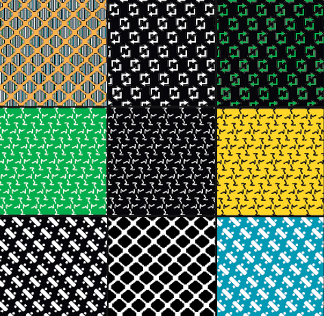
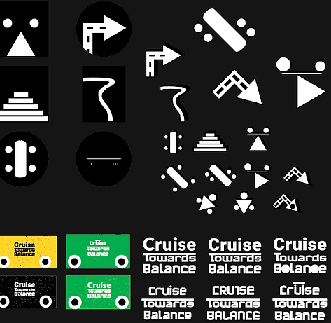
I realized the most important thing about skateboarding is balance! Going back to the basics of Graphic Design, I decided to research how to visually represent balance through the use of geometric shapes. The icons themselves are abstracted versions of a skateboard, a visual of balance and an arrow. The key to the design system was playing with colors, shapes, patterns and negative space while maintaining the idea of balance
and skateboarding in a more modern feel.
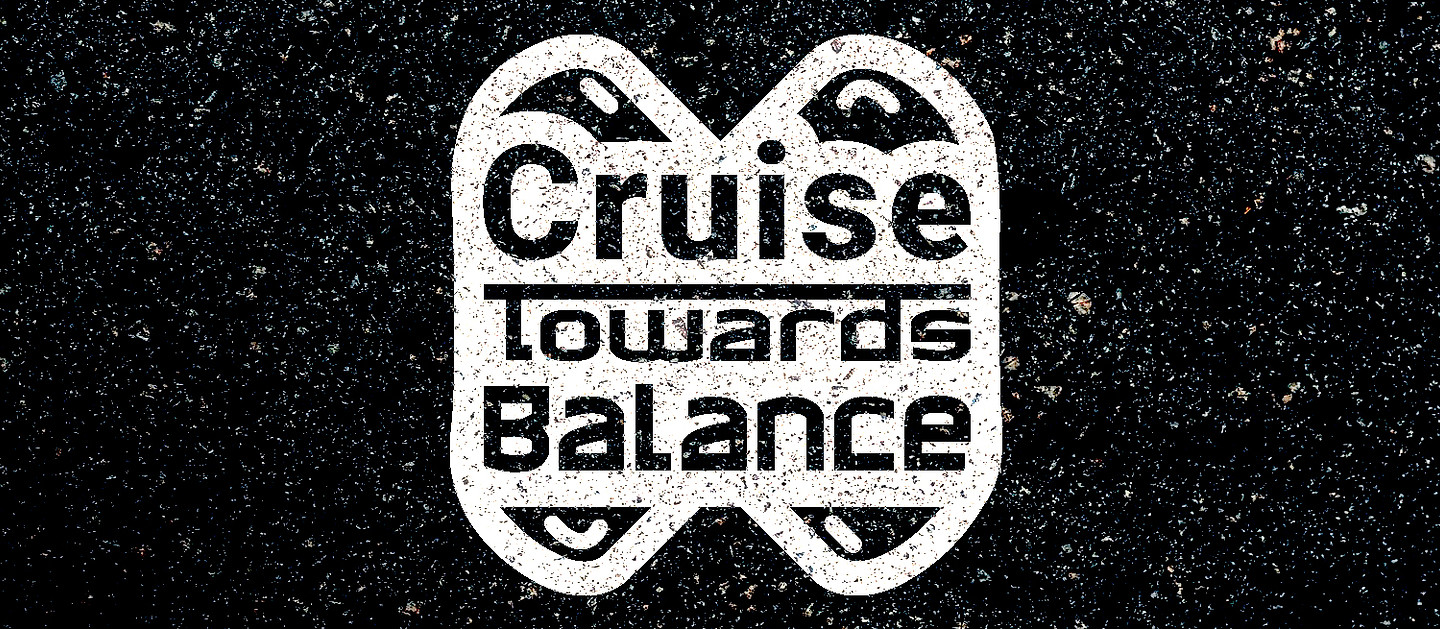
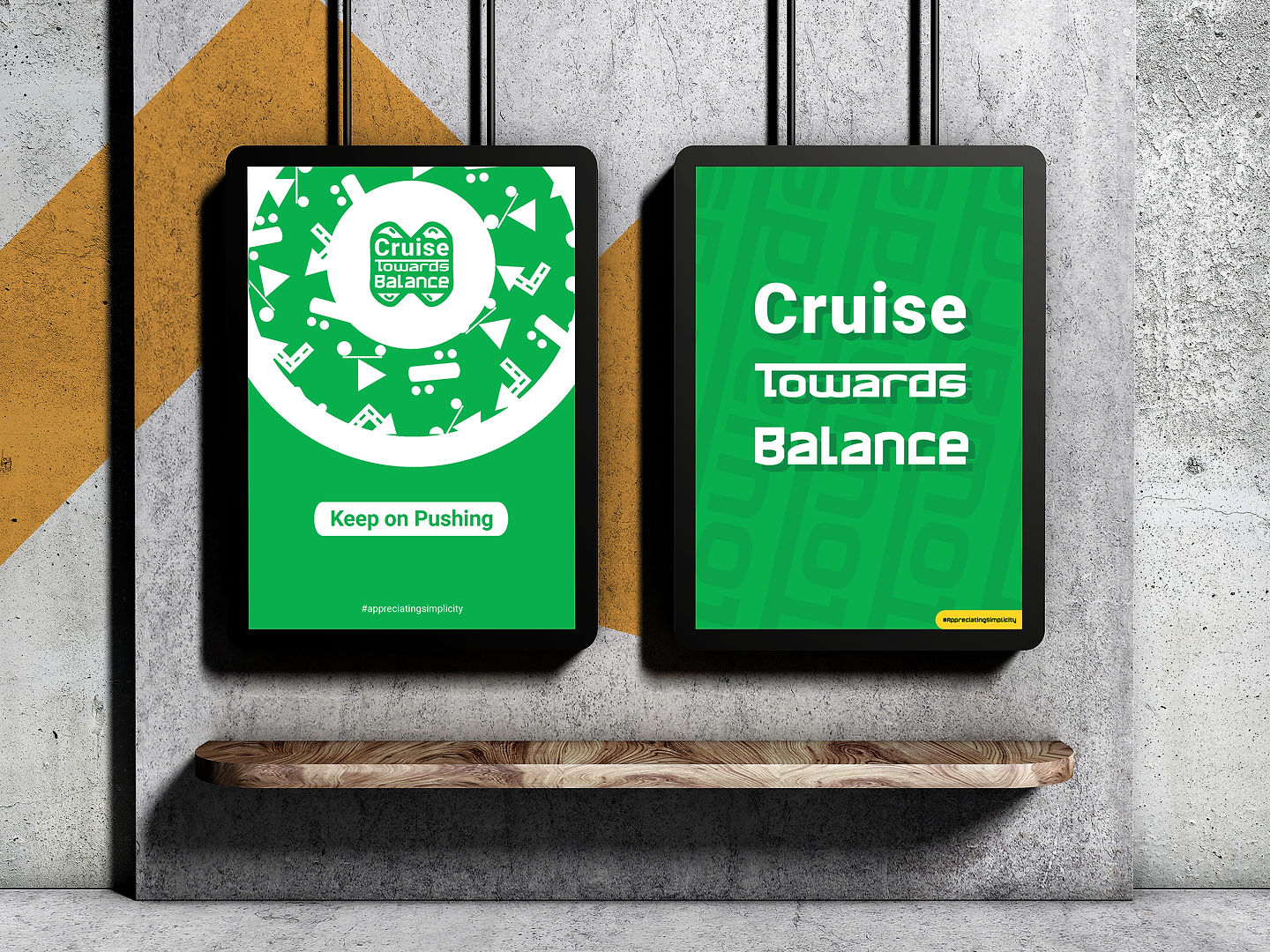
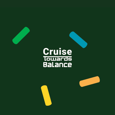
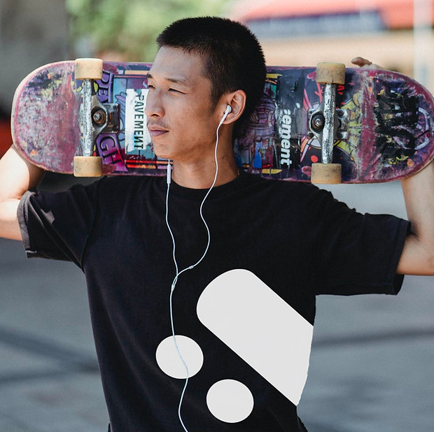
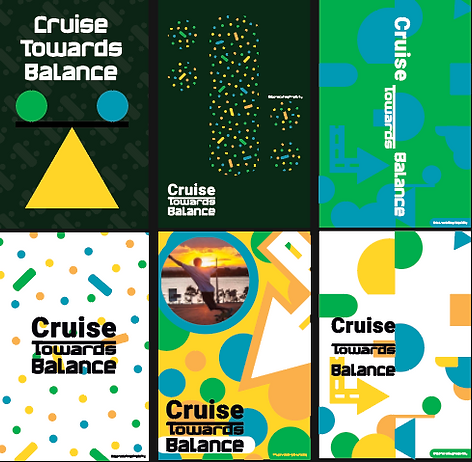
Logotype
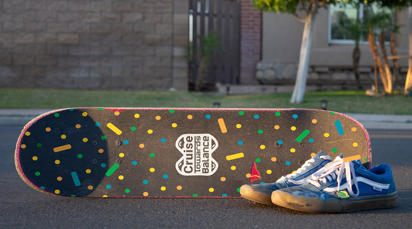
The Cruise Towards Balance logotype challenges were to represent skateboarding and at the same time, maintain the idea of balance. The T in towards is played with to represent a skate rail. The type varies in size per word, but is centered and lined up to show balance. The typeface for “Cruise” is Roboto while “Towards Balance” is in the typeface Hawkeye. The elements seen around the type, are decks! Plenty of offset for a sticker look and feel for the logo. Cruise Towards Balance!
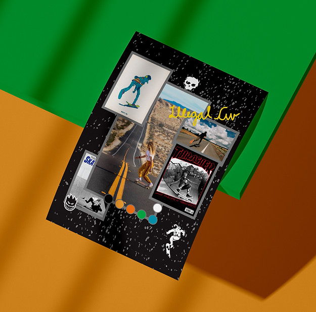
Moodboard
My moodboard represents my initial thought of the design system for the Cruise Towards Balance campaign. Most pictures were picked with the idea of showing the gritty roughness from skate culture. Keeping modern day skating in mind, I liked pictures that have an interesting view of roads. I soon found out that an element capturing my attention unintentionally was the contrast in these pictures! This contrast soon worked as an inspiration for my color palette and was integrated in multiple patterns and designs seen below!
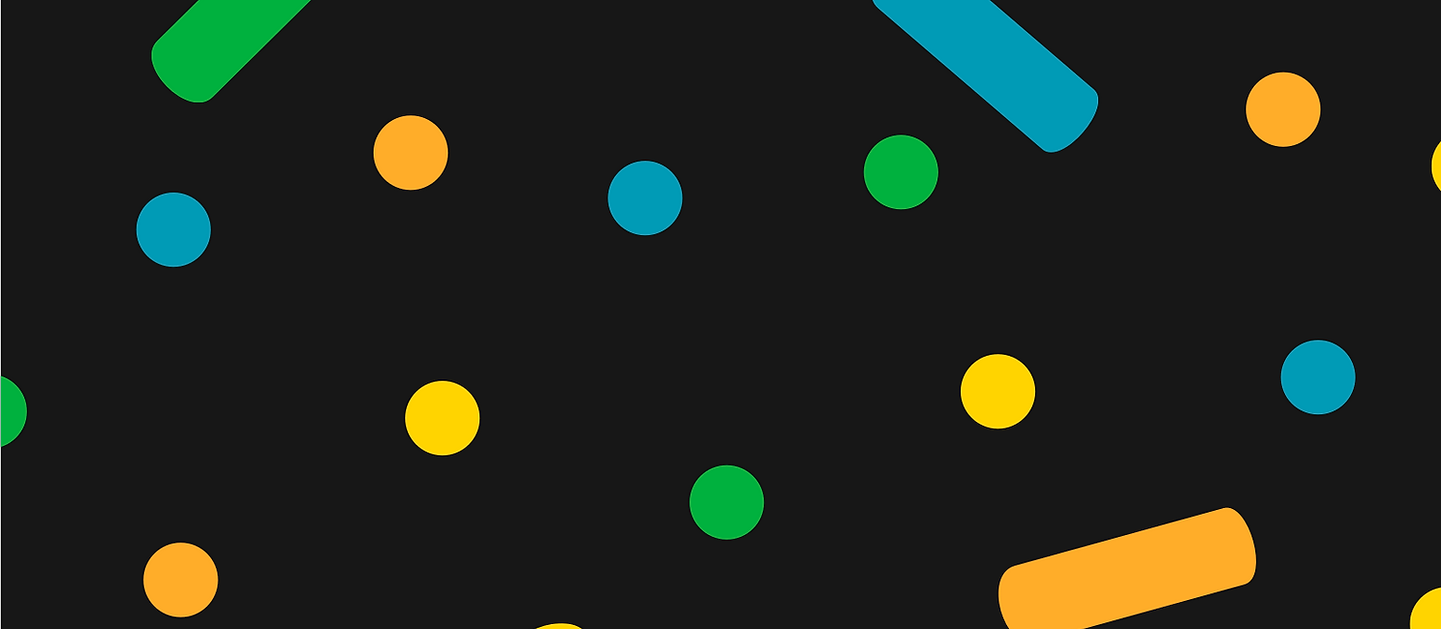
Hex: 00AE4D
RGB: 0,174,77
CMYK: 85,0,100,0
Hex: 0099B4
RGB: 0,153,180
CMYK: 81,21,24,0
Hex: FBB04B
RGB: 251,176,75
CMYK: 0,35,80,0
Hex: FFD527
RGB: 255,213,39
CMYK: 1,14,93,0
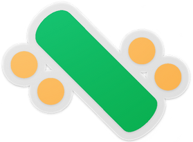
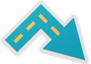
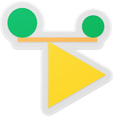
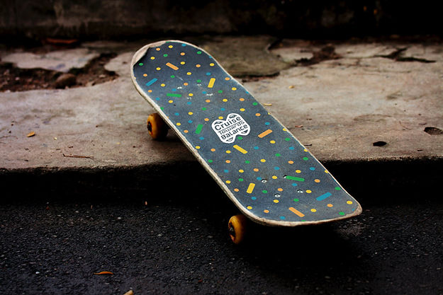
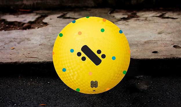
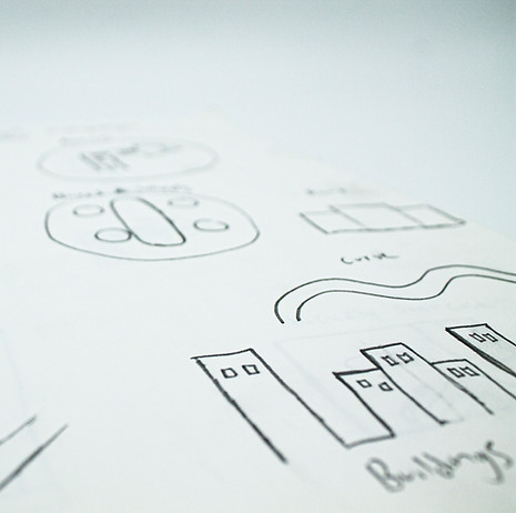
Icons
Skateboard icon
An abstracted deck and wheels to remind you of that board that we are so dearly missing to cruise on!
Tri-Balance icon
An icon representing balance in the way I was first taught how to visually create an idea. Tri not too fall...
Arrow icon
Because we skaters are great with our sense of direction, we added an arrow icon. Watch the streets!